
This page is for admins who set up Omniform: creating a form, choosing its fields, and deciding what is sent with each submission. If you are building the endpoint that receives the data, see the Developer Reference.
Manage forms
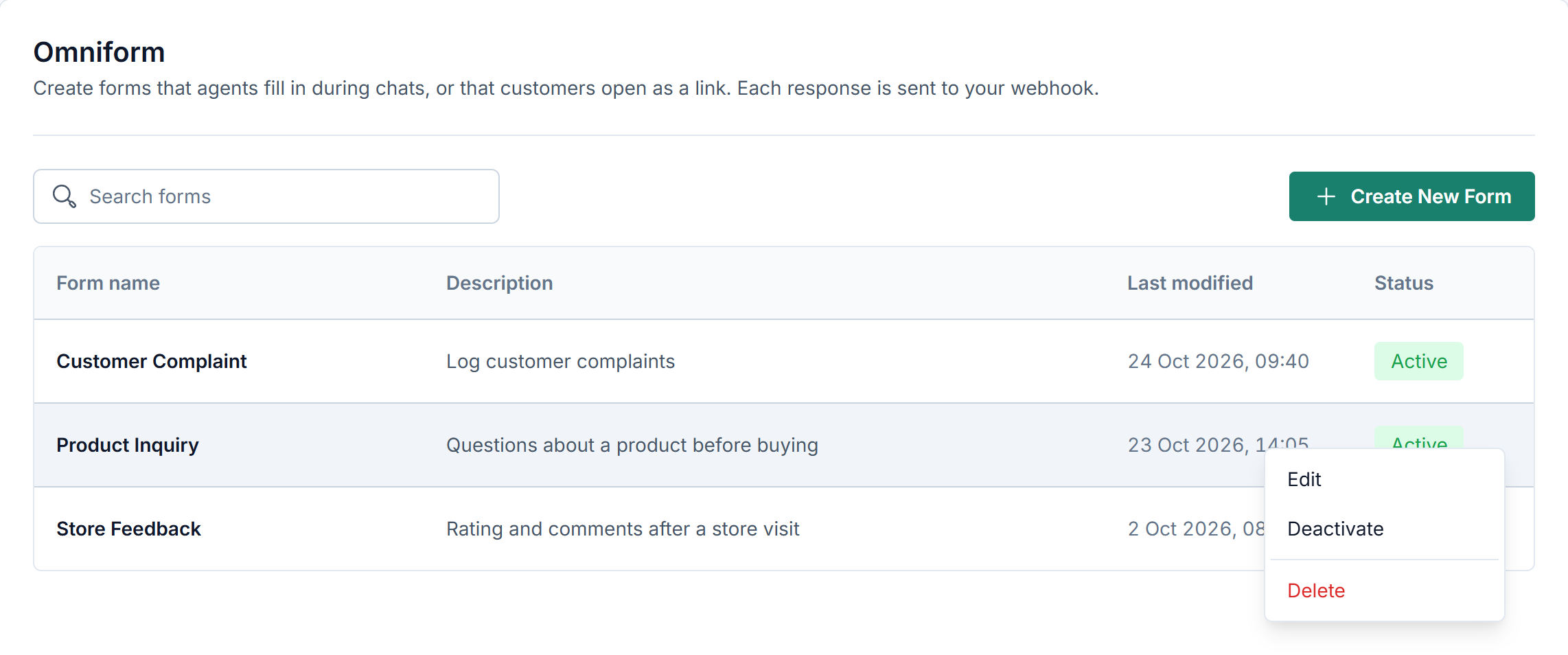
Forms lists every form of your app in a table: name, description, last modified time, and status (Active or Inactive). Newest forms are at the top. Use Search forms to find a form by name.
Click a row to open its menu:
Edit: opens the form in the builder.
Deactivate or Activate: changes the status at once, without a confirmation.
Delete: removes the form after you confirm.
Only active forms appear in the agent's Omniform widget. Deactivating a form also stops every customer link created for it; activating it again makes links that have not expired work again. See Share Forms with Customers.
Create a form
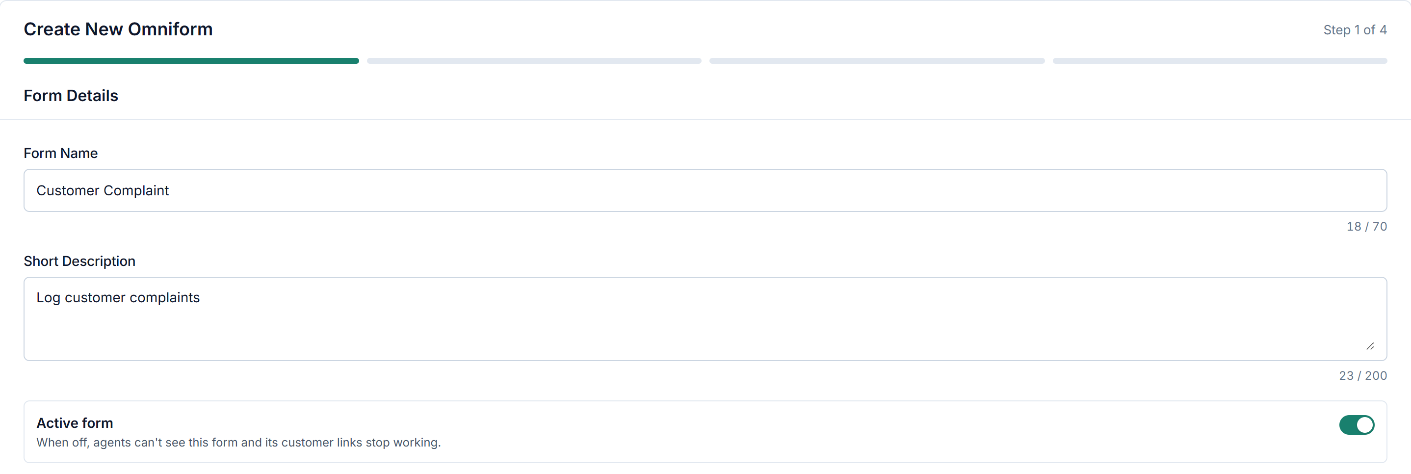
Click Create New Form. The form is built in four steps, shown at the top of the page:
Step | What you set |
|---|---|
1. Form Details | Form Name (up to 70 characters), Short Description (up to 200 characters), and Active form |
2. Form Builder | The fields, and the Attachment option. See Field types |
3. Omnichannel Data | The room data sent with each submission. See Omnichannel data |
4. Submit Action | The submit button text and the webhook. See Submit Action |
Use Next and Back to move between steps. Next checks the current step and shows what is missing, for example a field card that is still open (Save or cancel this field first.).
On the last step, click Create Form. The form is saved only then.
Cancel on the first step leaves without saving. If you leave the page with unsaved changes, Omniform asks you to confirm.
Active form controls whether agents see the form. When it is off, agents can't see the form and its customer links stop working.
To change a form, choose Edit in its row menu. Editing uses the same four steps, but you can click any step directly, and the last button is Save Changes.
Forms created before this version may have a name longer than 70 characters or a description longer than 200. They keep working, but the counter turns red when you edit them, and you must shorten the text before Save Changes.
Good to know:
Drag a field card to change its position in the form.
Tick Mark as required to make a field mandatory. Optional fields show an optional tag next to their label, in the agent widget and on the customer page.
Field types
Choosing a field type
Field type | Use it for |
|---|---|
Single-line Text | Short answers, such as a name, an order ID, or an email address |
Multi-line Text | Longer answers, such as a description or notes |
Phone Number | Phone numbers, with a country code |
Checkbox | One or more choices from a short list where every choice should be visible |
Dropdown | One choice from a list you type, or load from your API |
Multi-select | One or more choices from a list you type or load from your API; suits long lists |
Nested API Dropdown | One choice across levels that depend on each other (for example Province → City), loaded from your API |
Date and Time | A date, or a date with a time |
Number and Decimal | Numbers, with or without decimals |
Every field has a Field label (the name shown above the field) and Mark as required. The sections below cover the settings that differ. For the format each field sends to your webhook, see Field values by type.
Text fields
Single-line Text: Set Input format to Text (default) or Email. With Email, only a valid email address can be submitted.
Multi-line Text: No other settings. It can also receive the room's additional information; see Additional Info.
Phone Number: The person filling the form picks the country code from a list and types the number; the field accepts digits only.
Choice fields
Adding choices
This applies to Checkbox, Dropdown, and Multi-select with a Manual source.
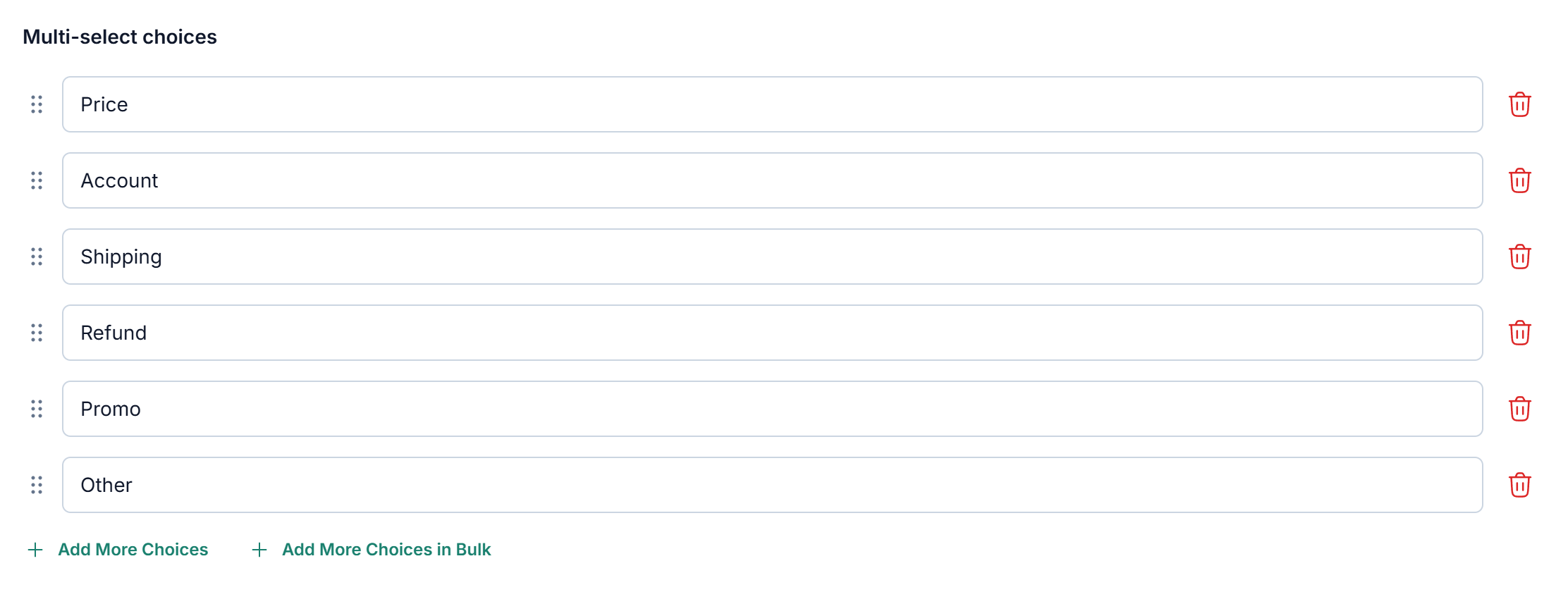
Type one choice in each box. A new field starts with two empty boxes.
Click Add More Choices to add another box. Drag :: to reorder a choice, or click the delete icon to remove it. A field always keeps at least one choice, so the delete icon is hidden when only one is left. Empty boxes are dropped when you save the field.
To edit the whole list at once, click Add More Choices in Bulk. The text box opens with your current choices, one per line. Edit them or paste more, then click Save Choices. Empty lines are ignored.
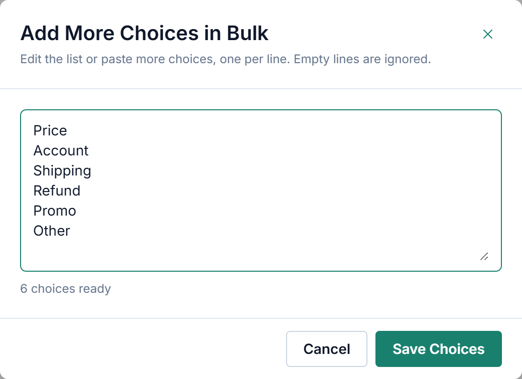
Save Choices replaces the whole list with the content of the text box. On a Multi-select with a Choice Limit, a warning appears if the list has fewer choices than Min or Max; you can still save it, but you must update the Choice Limit before saving the field.
Checkbox
Use it for: one or more choices from a short list where every choice should be visible.
In the widget, every choice is shown at once and the agent ticks one or more. For a long list, use Multi-select or Dropdown instead.
Dropdown
Use it for: one choice from a list.
In the widget, the agent opens the list and picks one choice. A search box appears when the list has more than 5 choices.
Settings:
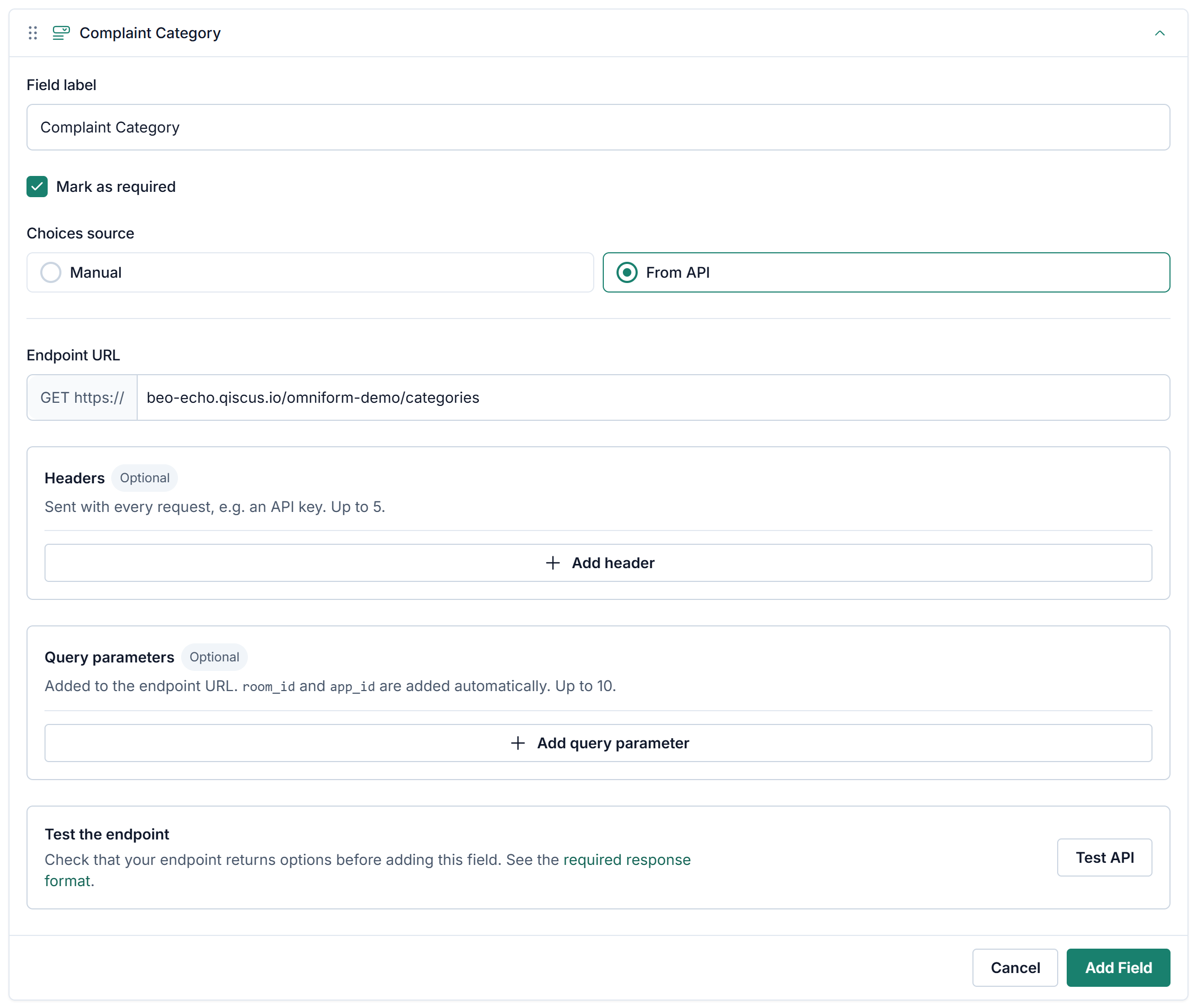
Choices source: Manual (default) to type the choices yourself, or From API to load them from your endpoint. See Load choices from your API. Dropdown fields created before this setting existed use Manual.
Multi-select
Use it for: one or more choices from a list you type or load from your API. Unlike Checkbox, the list stays collapsed until it is opened, so it suits long lists.
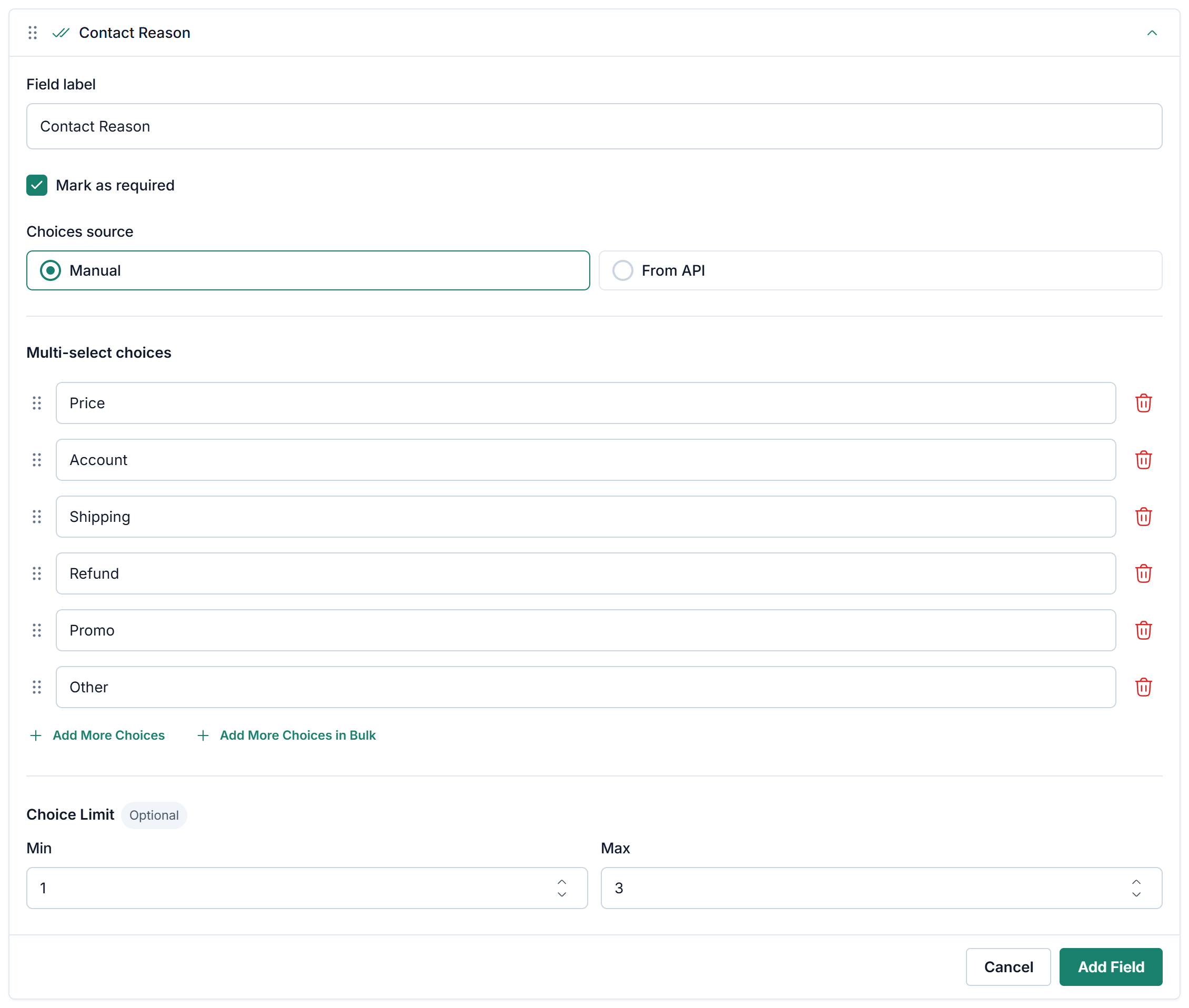
Settings:
Choices source: Manual (default) to type the choices yourself (see Adding choices), or From API to load them from your endpoint (see Load choices from your API). For Manual, the Add More Choices in Bulk pop-up also removes spaces at the start and end of each line, ignores empty lines, and shows how many choices the list will have.
Choice Limit (optional): Min and Max number of choices that may be selected.
Both accept whole numbers from 1 to 999. Leave a box empty for no minimum or no limit.
Min can equal Max when an exact number of choices must be selected.
For a Manual source, neither value can be higher than the number of choices.
For a From API source, the number of choices is known only when the form is opened. If your endpoint returns fewer choices than Min, all available choices must be selected instead.
Min does not make the field required. If the field is optional, it may be left empty; once something is selected, at least Min choices must be selected.
In the widget:
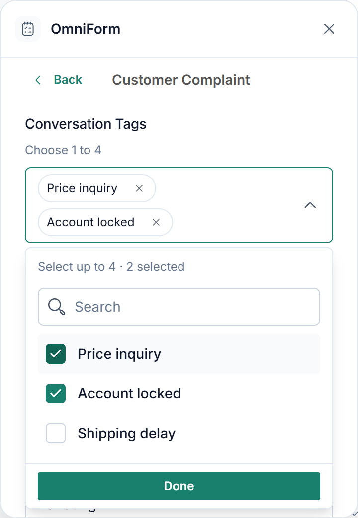
Selected choices appear as chips inside the field. The agent removes one by clicking × on its chip, or by unticking it in the list.
The list stays open while the agent selects, and closes when they click Done or outside it. A search box appears when the list has more than 5 choices.
With a Choice Limit, the rule appears under the field label, for example Choose 1 to 4, and the top of the list shows the limit and how many are selected, such as Select up to 4 · 2 selected. Once Max is reached, the remaining choices are disabled.
When many choices are selected, the chips collapse into +N more.
Nested API Dropdown
Use it for: one choice across levels that depend on each other, such as Province → City → Postal Code or Category → Subcategory → Item. Each level loads its choices from your API, based on the choice made in the level before.
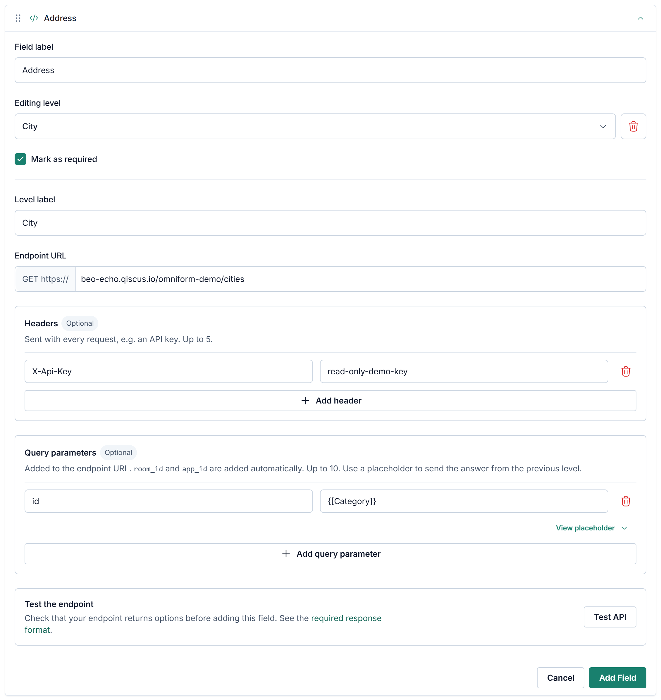
Field label: the name of the whole field.
Editing level: the level you are setting up. A new field starts with Category.
Level label: the label of this level, for example "Province".
Set up the endpoint of this level; see Load choices from your API.
Click Add Subcategory to add the next level, then pick it in Editing level and repeat from step 3. A field can have up to 10 levels.
To send the choice made in a previous level to the next level's endpoint, use that level's placeholder as a query parameter value, for example {[Category]} or {[Subcategory 1]}. When you add a subcategory, a query parameter id with the previous level's placeholder is added for you.
Load choices from your API
This applies to every level of a Nested API Dropdown, and to Dropdown and Multi-select with From API as their choices source.
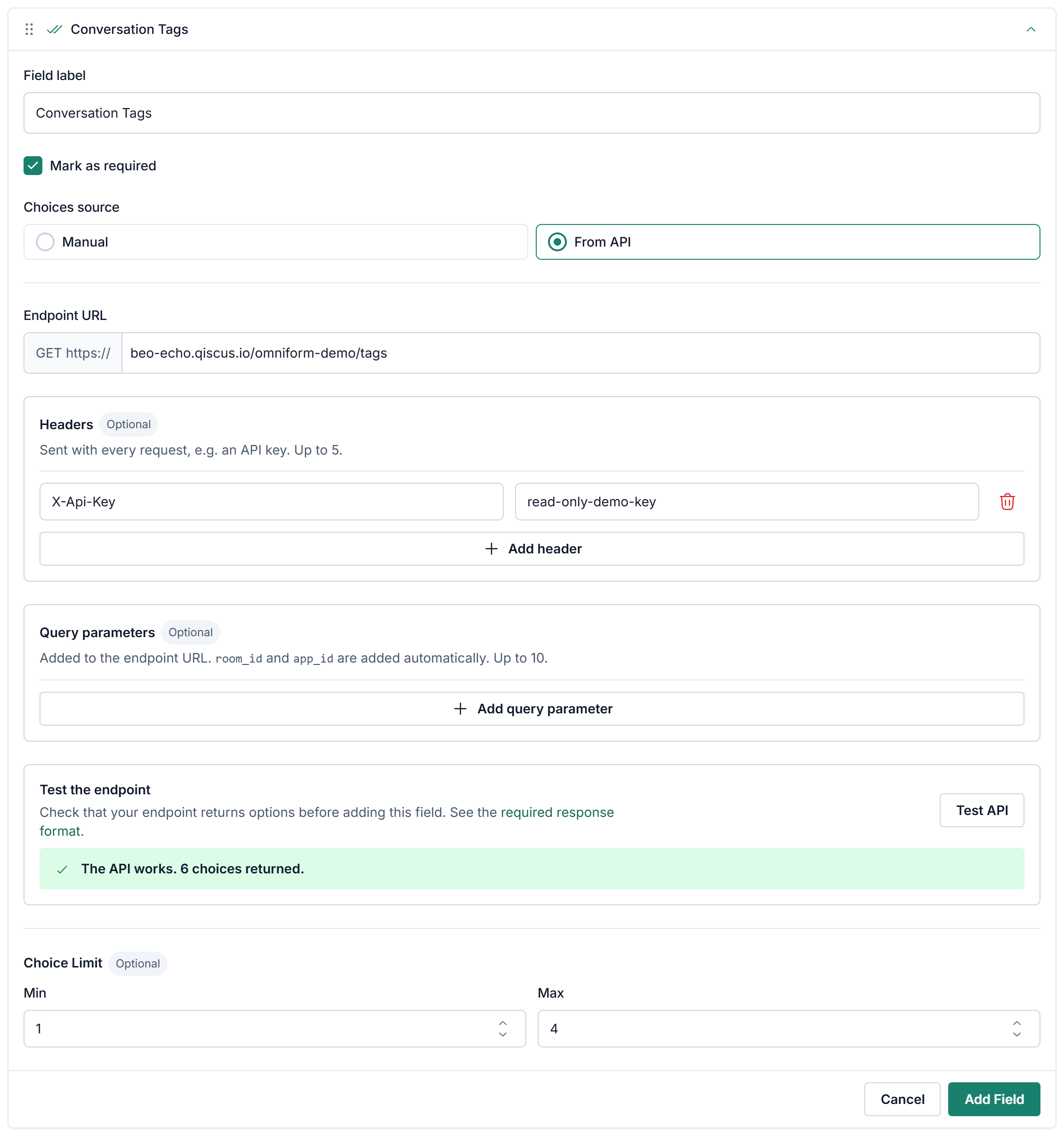
Endpoint URL: the URL that returns the choices. Only the GET method is supported. The URL must use HTTPS:
https://is already shown in front of the input, a pastedhttps://is removed for you, andhttp://URLs are refused. It must use a domain name;localhostand URLs with a port number (such as:8080) are not accepted.Headers (optional): up to 5, for example for authentication.
Query parameters (optional): up to 10.
Test API: calls your endpoint and shows the result under the button, for example The API works. 6 choices returned. If the call fails, the message says why, for example when your API can't be reached from the browser because of CORS.
Omniform adds two query parameters to every request automatically: app_id (your Omnichannel App ID) and room_id (the room of the conversation). Test API does not send room_id, because no room is open.
Your endpoint must return choices in a specific format. Share the Developer Reference with whoever builds it.
Switching the source later. You can switch a saved Dropdown or Multi-select between Manual and From API. After you save the form, new submissions send different values to your webhook (for example tag IDs instead of the choice text). Check with your developer before switching a field that is already in use. See Changing the source of a saved field.
In the agent widget, choices are requested from the agent's browser. On the customer page, Omniform's servers request them instead, so your endpoint must also be reachable from the internet, not only from your office network or VPN. See How the request is sent.
Date and Time
Use it for: a date, or a date with a time, picked from a calendar.
Set Input format to Date or Date and time.
The value is sent to your webhook in UTC. If your system uses another timezone (for example UTC+7), convert it on your side.
Number and Decimal
Use it for: numbers. Set Input format to Whole number (default) or Decimal.
Attachment
Turn on Attachment in step 2 to add a file upload area to the form. The same limits apply in the agent widget and on the customer page:
Up to 5 files per submission, 50 MB each.
Accepted types: JPG, JPEG, PNG, HEIC, PDF, MP4, MOV, DOC, DOCX, XLS, XLSX, PPT, PPTX, and CSV. Macro-enabled Office files (DOCM, XLSM, PPTM) and other types, such as ZIP, are refused.
A file that breaks a limit is refused when it is selected, with a message that names the file and the reason. The other files stay in the list.
Omnichannel data
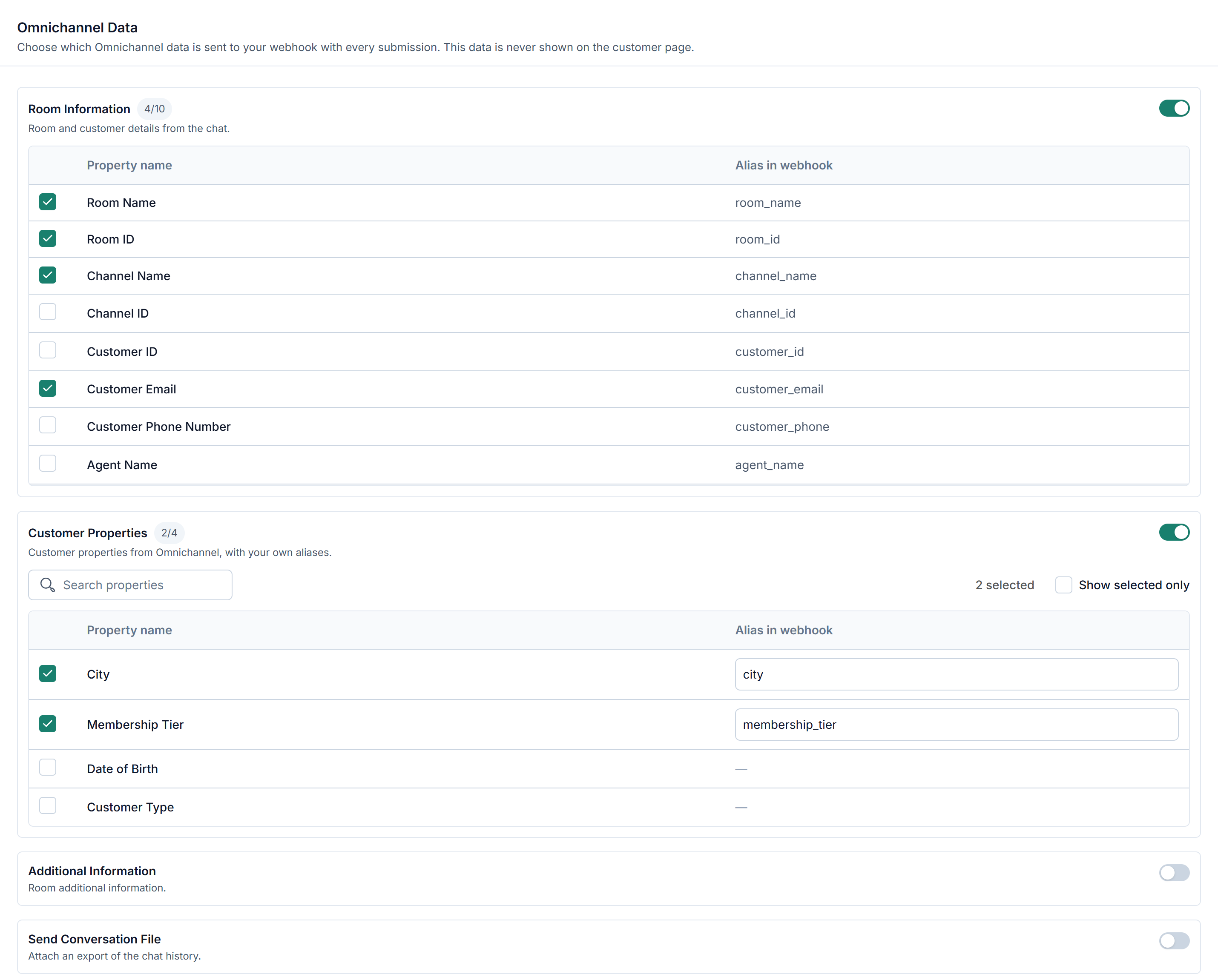
In step 3, turn on the Omnichannel data to include with each submission. Each option is set up right under its toggle. This data is sent only to your webhook and is never shown on the customer page.
Additional Info
Turn on Additional Information, then choose how to send it:
Send all Additional Info as Params: the room's additional information is sent as a separate list.
Append to a multi-line field: the information is added to a Multi-line Text field that you choose. On the customer page, that field starts empty, because the information is internal to the room.
Customer Properties
Tick the Omnichannel customer properties to send with each submission, and optionally set the Alias in webhook for each. Use Search properties and Show selected only when your app has many properties.
Room Information
Tick the room details to send with each submission:
Item | Description |
|---|---|
Room Name | Name of the room, usually the customer's name |
Room ID | ID of the room |
Channel Name | Name of the channel the customer used to start the chat |
Channel ID | ID of that channel |
Customer ID | The customer's ID in the channel, for example a phone number or email |
Customer Email | The customer's email, if available |
Customer Phone Number | The customer's phone number. Sent only when the customer ID is a phone number |
Agent Name | Name of the agent who submits the form, if they are assigned to the room; otherwise the first agent assigned |
Agent Mail | Email of that same agent |
Tags | Tags on the room |
Send Conversation File
Sends a link to the conversation history with each submission. It is only available for rooms that are already resolved: if the room is still open when the form is submitted, no conversation file is sent, even when this option is on.
Submit Action
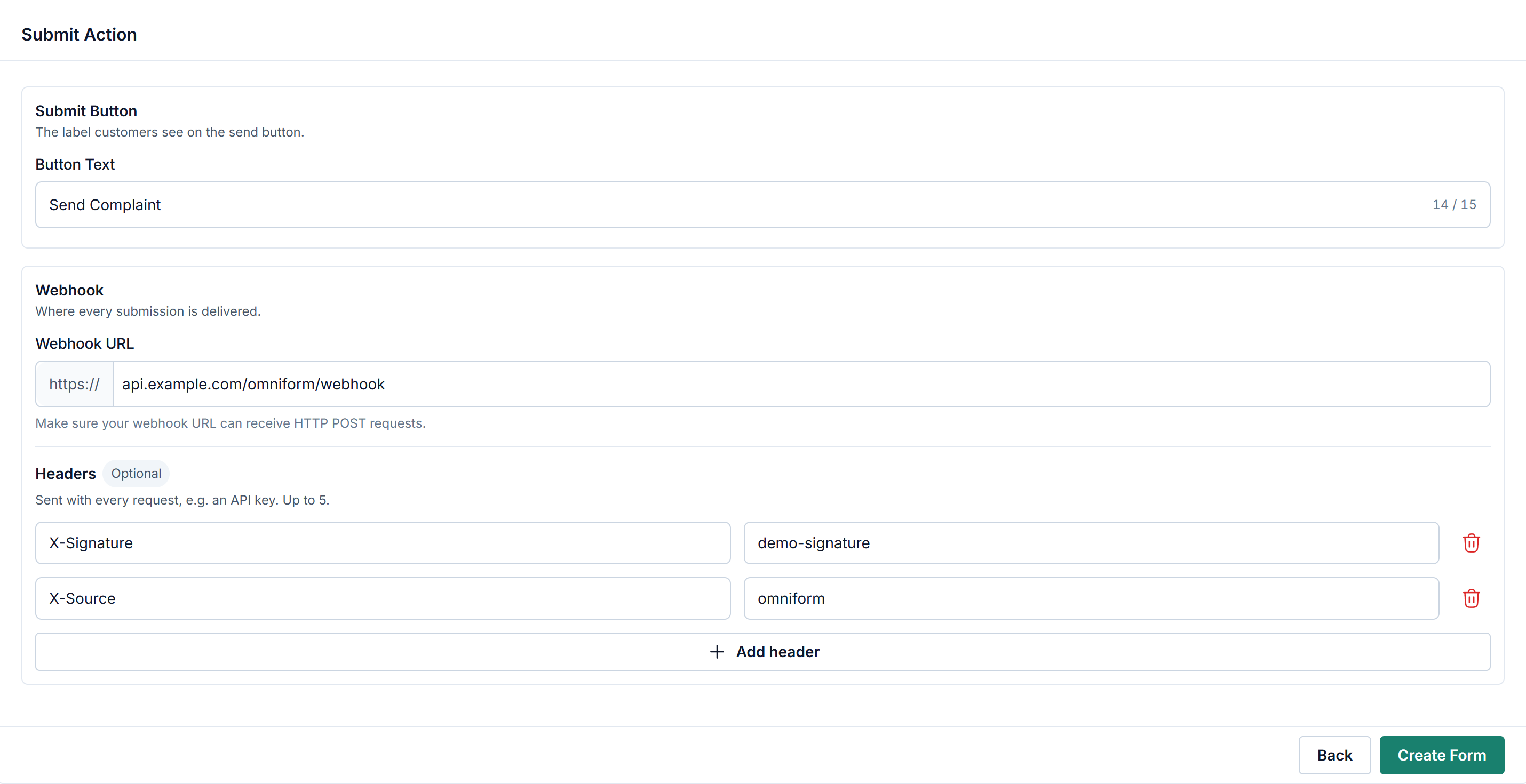
Step 4 sets what happens when the form is submitted.
Button Text (required): the label of the submit button, up to 15 characters. New forms start with Submit.
Webhook URL (required): the URL that receives each submission. It must use HTTPS;
https://is already shown in front of the input, and a pastedhttps://is removed for you. Forms created earlier with anhttp://URL keep working until you edit them.Headers (optional): up to 5 header name and value pairs, sent with every submission. Use them to let your system verify that a request comes from Omniform. Click Add header to add one.
What your webhook receives, and how it must respond, is described in the Developer Reference.